The Color Of...
- Carol Taylor-Kearney
- May 25, 2018
- 7 min read

When I first went through the exhibition spaces of the Cerulean Arts Collective Galleries this month, I thought I would be writing about color. Fran Lightman Gibson, Jeanne O’Shell, Jack Ramsdale, Stephanie Rodgers, and Ruth Wolf are definitely artists on the side of the “Colorists”. That is artists who allow color to be a strong, even dominant, feature in their artwork. But there is more to each artist than just their chroma.


At the doorway into Fran Gibson Lightman’s space I was thinking about the landscapes of Paul Cezanne, so many greens and yellows, blues and whites. But the green here felt more acidic and the organization was less patches of interwoven color than sweeps of exuberance sometimes even moving in a counter direction. The paint could be applied in relatively thick strokes and sometimes so thin it was like looking through to a stained canvas. Many of the compositions began, at the bottom (or foreground), as a void of warm sand moving up to calligraphic slashes of green(sometimes with other colors), resolving in the horizon, then devolving into the blue and white of the sky. I say “devolving” because nothing in these paintings dissolve or dissipate. They are very present and full of emotion and spirit. I think of Fran Gibson Lightman as the abstract expressionist of the landscape. In this she is a kindred spirit to Joan Mitchell, telling us that Nature is full of vim and vigor.

Jack Ramsdale is a photographer of cityscapes, suburban-scapes, industrial-scapes, and construction-scapes. The compositions are very tight, very formal, giving them a kind of silence. But there is also a dry wit caused by deflection, reflection, mediation, or
contradiction. For example, the central picture of the installation, “There Must Be an Answer for What’s Going on”, shows a gray moonscape environ of hills, piles really, cranes like bugs, ramps ending abruptly, and roads that turn to go out of the picture. BUT along the bottom center

is a wedge of brown earth and some foliage—the only instance of life. Is this a destructive process or a creative process? I feel like an alien from another planet watching the little creatures as they turn living earth to a dead zone. In other works Ramsdale allows reflections to disturb the continuity of the photo. Whether it is a reflection on a car hood in the foreground of a scene or a picture taken through glass so that it seems that there was a double exposure, every scene has an element of mitigation. Which provides a certain push-back, a separation that needs to be carefully observed. Not for the veracity of what is shown as we commonly think of photographs documenting our world, but as a query—a moment of doubt brought on by the presentation. My favorite is of a darkened room with a brown leather recliner whose shape I can just about make out. Interrupting this gloom is a bright rectangle, a window with open blinds looking out to a tree. Called “Waiting”, the paradox sets up a most wistful statement: waiting for what? For someone, for Nature, for action, for contemplation, for life, or for death.


The colors of Jeanne O’Shell’s paintings are pretty. The pinks, blues, creams, purples, and turquoise-greens remind me of “My Little Pony”, but the overall message is more like “My Pretty Pony”. What’s the difference? My Little Pony is a franchise by Hasbro that started as dolls for girls; “My Pretty Pony” is a short story by Stephen King (with illustrations by Barbara Kruger) about the nature of time-- “Time is a pretty pony with a wicked heart.” So how does this connect to Jeanne O’Shell’s paintings? Let’s start with the obvious, the subject. Her depictions include dolls, a charm, a perfume bottle, and numerous wrappers. All commercial objects meant to appeal. But these objects are in some form of discard. The charm has no chain and looks scuffed; the bottle looks empty; the dolls—oh the poor little dolls—are in various states of undress and posed as they would have been found at the bottom of a toy box, or in a basement or an attic. Somewhere they would not have seen the light of day and had been buried. They are grotesques with wild hair (if they still have hair) and broken eyes. Unlike the Velveteen Rabbit, they are not so much showing wear from love but from abandonment. And this is supported by the treatment of the painting surface and the brushwork. Many of the surfaces are uneven, partly due to the thick application of paint and partly due to something under the paint-- perhaps pieces of debris built onto the surface before it was painted. I also notice that white, black, or grayed paint is scrubbed onto the painting further reminding me of dirt or mold. All this gives another added depth to these paintings. As trash, they symbolically cross over to relinquishing their original meaning and purpose to become the artist’s meaning and purpose. A meaning less connected to nostalgia than postscript.
The paintings and mixed media artwork by Ruth Wolf are different from anything else I’ve seen at the Cerulean Arts Collective this year. The first difference is their size. Her small
works are the size of many people’s middle-sized work, her mid-size works are large, and her large works are “pace back and forth in front of them” big. This creates a very different

relationship with the viewer. Where smaller artwork invites the viewer to look into a world, a wall-sized work envelopes and makes it impossible to see the whole piece without, at least,
moving the head. We become surrounded by a different world—the world of the painting. This brings about a second phenomenon—we position ourselves so that the work becomes smaller in scale. That is, we step back from the artwork to make it so that we can see the
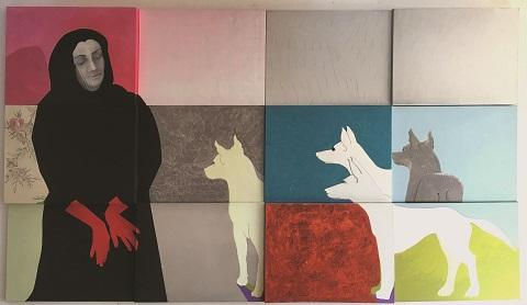
whole thing at one look or, more importantly, to equalize its size to the size of our body. In an enclosed space one can really feel the uneven power dynamic as it is impossible to find sufficient back-up area for equilibrium. But these are not the only bumps along the way. In “NO CRY”, for example, twelve separate canvases of varying depths are linked together to form a picture. The entire picture shows a woman in a black burka with red hands looking toward four dogs. The dogs appear to be German Shepherds, their ears alert but their postures not menacing. The expression on the woman’s face is calm, almost hypnotic. Her hands, the color of blood, are positioned on her knees, not raised in supplication, not folded in prayer, but turned like fans across her lap and over her knees. There is violence, or the

possibility that violence has been or could be done, but there is not. We are stuck in an inscrutable state. Each figure is delineated as much by the color and pattern surrounding them as their specific details. And the canvases are arranged so that there is a push and pull to the picture even as each rectangle is flat. I start to think that maybe each of the canvases are slabs—the slabs of ancient murals, the slabs of walls shifted by time and erosion, the slabs of grave markers. But the materiality of it pull me in, too. The black is so opaque and matte, some of the patterns are subtly drawn on and some seem to be perfectly joined collage, so perfect that I need to get close and touch them. All this—the attraction and resistance, clarity and ambiguity-- leads to a feeling of enigma—a commonality to all the pieces. For they are all made of beautiful colors and color relationships; unusual materials from glitter and glow-in-the-dark paint to metallics and silk scarfs; layers of color that appear through each other. And speculative choices. With every painting I feel like I am entering a fairytale or a myth. Not a specific story laid out by the artist but an archetypal dream to be worked through. Yet, with “50 Sets of Eyes” looking through a golden haze, I wonder who is watching, me or them, or if we are all anonymous, even to ourselves.
I think Stephanie Rogers lives in eternal sunshine, unless it is nighttime when luminous colors radiate over areas of dark, yet still pure, color. But I digress. Stephanie Rogers is an artist of vivacity. Her colors are bold, working back and forth between light and dark, warm and cool.

She is not shy with her brushwork either which is confident and active—melting from one color to another here, swooping on-top-of there. This lends a quality to her work that is childlike because it feels unrestricted and direct. It seems more interested in communicating joy—in life, in the world, in the making of these paintings. And I might add, for me, in the viewing. But these are not just exercises in expression. The compositions to each of the paintings is sophisticated. For example, “Whimsy of Spring” has

two trees creating a triangle that separates the composition into two areas—the warm yellow and red within the bend of the trees and the cooler yellow and green without. And like Cezanne’s “Great Bathers”, this is a painting conveying sunshiny bliss. Similarly, many of the paintings have an outlined shape that designates a realm within the realm of the painting. In “Red House” the red strokes of paint outline a house. But it seems more incidental than in this work as it could have been painted over the already existing colors. While in other pieces like “Camping” and “Popped Up Poppy” the colors inside the outline appear to be separate, an addition to the story. Looking at Stephanie Rogers’s work is not about deciphering, not about logic, not even about fun—though she may disagree with me here. It is about something very serious and that is being alive, being in the moment, being an individual. Her work celebrates this.
All the art works from Cerulean Arts Collective will be available for viewing in person until June 9th. You can also visit the Cerulean Arts web site and click on the artist name at www.ceruleanarts.com. If possible, I encourage you to see the work in person. Also, Cerulean is with Artsy at www.artsy.net You can go to the home page and type the artist name into the top, left searchbar. OR go to www.artsy.net/ and type in the artist name without spaces. But, for best results, stop by to see the exhibitions at Cerulean Arts Gallery & Studio1355 Ridge AvenuePhiladelphia, PA 19123. The hours are Wednesday - Friday: 10am - 6pmSaturday & Sunday: 12pm - 6pm.


Comments