A Certain Slant of Light at Cerulean Arts Collective
- By Carol Taylor-Kearney
- Jun 25, 2019
- 8 min read
Light is streaming outside and changing with the drifting clouds. This is also true as I visit the galleries at Cerulean Arts Collective this month where artists Cathleen Cohen, Ian Wagner, Mashiul Chowdhury, Denise Sedor, and Kimberly Hoechst are exhibiting their paintings. Each takes a very personal and distinctive approach to handling this element.

Cathleen Cohen shows work that runs the gamut of representation to lyrical abstraction.

Although the handling of her materials-- watercolor and graphite on paper— is consistent, as you walk through and examine her pieces you begin to realize her methods. By comparing one painting to the next you realize her lines, shapes, color, and brushwork are a vocabulary for her. For example, Sacred is a painting dominated in the right foreground by a weathered tree. Another black-barked tree holds the vertical, mid-left. Pools of color make stepping-
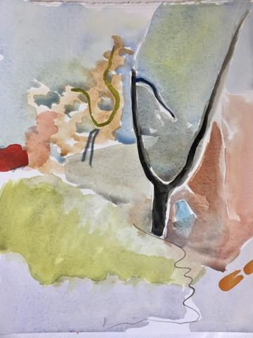
stones around and through these verticals creating the rest of the landscape—ground with shadows, bushes, foliage, sky. A wonderfully colored, if washy, recording of a

familiar scene. A site, I would guess by the amount of similar woodsy-scapes, that she visits often and contemplates deeply. I next turn to Lift, a work rich in decorative appeal. In this painting the two trees of Sacred have become tuning forks or two figures with their arms lifted in swaying dance. Curvy areas of paint fill in the details of the scene. But I am also more mindful of the work of her brush and the textures and patterns it creates. Finally, there is Watch for It, also loosely painted. Here the particular objects of the “real world” have become unmoored-- separated from their “objectness”. They are shapes floating like snippets of thought or consciousness. I come away from Cathleen Cohen’s gallery feeling like a visual linguist having taken apart the elements of a perceived experience to create steps from “realism” to “abstraction” to “non-objective”. I find this really interesting because it means that her “light” is illumination.


Ian Wagner is an artist who uses value—the values of his black ink on his white paper and value as meaning the regard by an observer. Because he is working almost exclusively in monochromes there is a noir aspect to what he presents. This is assisted by his subject matter—generally figurative— and the allusions to the movies, fashion, or other theatrical venues he chooses. In Stage Fright a whirl of gray curtains seem to be opening on to a shapely woman backlit by a brilliantly illuminated stage. In Premonition a tuxedoed foreground figure is

separated from a figure with a top hat by a wall of gray. This emergence and disappearance of figures from and into dark areas lend a sense of mystery, if not portent-- sometimes sexual, sometimes sinister. And sometimes comical, as in Nineteen-Nineties, a seeming throwback fashion shot of a model in a trench coat with a shag haircut, large sunglasses, and pink wrap-dress. Aside from the very reduced palette, there is a reduction in specific detail. Wagner provides just enough mark-making to set up each scene. I use “set up” rather than “organize” or “arrange” because there is an observer quality to these works but not quite enough information to be specific. Thus Wagner is a creator dissociated while the viewer becomes the one who attaches their conclusions—be they voyeuristic or priggish. Each piece in this group works as a vignette and all together as pieces of a larger story I have strolled past. I leave feeling like a flaneur.
Mashiul Chowdhury presents experiences of the urban environment through abstraction.


These paintings are elegantly presented and of a size that makes me feel like I can hold them in my hands—like a memory box or reliquary. This seems to be an important part of what he is doing. Each painting is named for a specific place in Philadelphia. And each piece recalls the light of a time of day. Looking at the series Chowdhury has created bearing the name “Hunting Park”, there is Hunting Park 1. This is, to me, the most “representational” in that I can see the carved outlines forming the outline of different buildings. At the same time, there are layer upon layer of paint—white predominating at the top, going down and mixing with warm ochres and reds coming up from the bottom. Along the edges of these colors peek the layers that had been applied before—greens, blues, blacks. Even with all the white at the top, the painting feels warm. I am reminded of the aftermath of a sudden rainstorm on a hot day when heat rises from the asphalted streets. In Hunting Park 4, most of the painting appears to be in yellows—light at the top, darker at the bottom. These yellows (and some more structured shapes in white and black) are covered by two cloud-shapes of blue. Centered at the bottom is a puddle of violet-blue that is mostly covered by the darker of the yellows. Once again, lines are incised to pull out more geometric lines that remind me of building outlines. The palette used is one of complements which encourage each other to the luminescence of a sunny day ahead. Quite different yet related is Hunting Park 3. I notice the same colors used in Hunting Park 1 at the bottom and the yellows from Hunting Park 4 at the top. Sandwiched between is a mass of black shapes on top of which remnants of pink and white take shape. Once again I am assisted to pull out buildings by seams and edges. Here I think of night falling with shadowy houses and structures yet the golden and red glows of the setting sun. As I look at these paintings, I am aware of more than just figuring out “narrative”. Whether that is a story or place or thing that I can recognize. I also become moved by the arrangement of the paint and its colors. I find myself equally responding to these as I would to the paintings of Mark Rothko, or more precisely, Clyfford Still. The surfaces are luscious and seem to hold a history as I can catch a glimpse of the build-up of each layer. In this way they also remin
d me of the neighborhoods in
Philadelphia, of the city itself. Each has its own development and the buildings—and particularly the walls of the buildings—still show parts and pieces of what and whom have been there before. In a similar vein, Chowdhury presents a total of five pieces named "Philly Untitled" numbering them 1 - 5. These are not only paint-layered but full of marks making them very emotional. I am not sure that he is celebrating change, making his own mark on them, or trying to obliterate them. With his somewhat limited palettes particular to each piece and handling of his paint I am reminded of the abstractions of Philip Guston. But then I hit Philly Untitled 5 with its change of color and numerals embedded in the paint-- perhaps a connection to Jasper Johns and his number and map paintings. It will be interesting to see how this develops.

To enter Denise Sedor’s gallery is to enter a vault of jewels. Just as rocks are fashioned into gems, Sedor has fashioned, stroke by stroke, layer by layer, her paint into these glowing
artworks. She is a painter who uses the arsenal of her materials to produce her rich results. This arsenal can be her brush stroke, scraping, and application of her color; her palette of often saturate color; her contrast

of values and/or temperature of the colors used; even the size of the area and its positioning on the canvas create a great effect.
In Blue Lagoon and Inflorescence, the compositional placement of the principle color— blue in Blue Lagoon, green in Inflorescence— makes a bull’s eye shot of paints on a square canvas. The other colors that create a surround and are splotched through the “principle colors” generate a very different phenomenon between the two. In Blue Lagoon the surround color is white and


daubs and smears of white, red, green, even black can be seen. Even without the title the sparkle of this canvas relates to light on water. In Inflorescence the green with strokes of yellow and red throughout lift off of the darker blue ground. Here, I think of looking down on plants. You can really get the scope of her ability to keep it interesting when comparing two paintings with similar compositions but opposite orientations. City Lights is a horizontal work while Lost City is a vertical. Both are primarily blue (a cool color) paintings with a wedge of warm colors coming in from the right. In both the upper area is darker than the lower area. This makes the warmer, lighter valued wedge shine. The wedge shape also is a diagonal indicating disappearance into the interior of the painting. Smartly, the blue at the bottom of Lost City is slightly less saturate as well as lighter and has an irregular edge that blends into the yellows and oranges (complementary colors to the blue). I feel as though I am standing at a distance looking through rising clouds to city lights that suddenly come into view. In City Lights there are of yellow, orange, and white coming through a light but saturated blue that keeps all the colors on a similar plane.


This is my first-time seeing Kimberly Hoechst artwork and I am so glad to be introduced to it. By her own words Hoechst is a painter of “ordinary things”, but she has a way of making the familiar something to appreciate and contemplate. In the hallway just outside her gallery are two “exteriors”. One is Bays on North Clayton which reminds me of Edward Hopper’s Early Sunday Morning by its recording of the effects of light on and the patterns presented in a row of archi-tecture. Eastward on the Platt arranges other, more linear patterns of the girders of a bridge against the sky, of the shadows of these girders on the road, of a city in the distance. In each of these there are pockets of space made by the use of color—darker against lighter, brighter against duller, warmer against cooler. As lovely as these are, though, they are a rubric for the even more intricate work that follows. Interiors dominate most of the walls here. third holds two rural landscapes with emotive skies. Called Cheyney Farm Sunrise and Cheyney Farm Sunrise 2, the transition of light show that Hoechst is a landscapist to be reckoned with. But it is her interiors that draw my greatest approbation. In A Little Night Music I am placed in a

formal lobby with a grand piano, seating and windows to the left side, and other rooms off of this space. Overhead large light fixtures provide one kind of lighting to these rooms while, as I am moved to the middle of the painting the “window light” adds a more complex situation. The subsequent areas off this foyer have colors that connect it to this larger space—for example, the right-hand room is an orange that connects to the reds and golds of the rug, and the back space is almost monochromatic in its cool whites and light blues. Another handsome painting next to A Little Night Music is Inside or Out? A pleasant and empty dining room is shown with seating inside as well as outside on the veranda. Although an immaculate and well-dressed table appears in the foreground to invite us to sit down, the clear and bright day beckons just past it. This is achieved by placing warm darks in this foreground area and pastel-ly cools in the background. All the objects are beautifully wrought with clarity and

detail. Although each of the spaces Hoechst gives us are full with lots to examine, there is not a sense of life, meaning that it all feels like a solitary experience— not lonely but singular.
All of these fabulous artworks will be at Cerulean Arts through June 30th. If you cannot make it to Cerulean Arts, make sure you check these out on their web site at https://ceruleanarts.com/pages/artists .
A little promo here … I hope that you begin to follow me on Instagram at https://www.instagram.com/caroltaylorkearney/. Why? Every month I post (numerous times) a ”One-Minute Crit” of the artwork at Cerulean Arts Gallery. (I also share it to Facebook because sharing is caring.) Generally, I explore the Cerulean Arts Collective Galleries and then come out with a few sentences to entice viewers to stop by—either the galleries or the web site—to take a look at the art. This is followed by a blog on each of the artists which you have now read! Here are the “One Minute Crits” for each artist:
Cathleen Cohen
Ian Walker
Mashiul Chowdhury
Denise Sedor
Kimberly Hoechst


Comments