Fantasia Is Reality at Cerulean Collective
- By Carol Taylor-Kearney
- Feb 5, 2019
- 8 min read
Andre Breton once said, “The imaginary is what tends to become real.” The artists at Cerulean Collective galleries this month—Kathleen McSherry, Elaina Posey, Diane Collins, Rachel Romano, and Karen Rapp Bull—fulfill that rare ability to marry what they have at hand, that is their materials and observations, with their imagination to come up with the unique. And moving from one gallery to the next really calls on mental agility to contemplate each artist’s distinct vision.

Kathleen McSherry’s eye-popping works (and I mean that literally, so many eyes it feels like the work is looking at me!) begins on a joyful note with Mardi Gras hanging on the wall just outside her room. McSherry takes found objects, detritus from our world, and revives and revitalizes them by forming mini-installations that can be transported and hung on a wall.

These are shrines to the disposable with messages religious, social, and political. In their mystery and their use of bric-a-brac they remind me of Joseph Cornell’s boxes. And, as a matter of fact, several of her pieces are collected in boxes. But going back to Mardi Gras, a wood-framed clock whose face we partially see, supports a brown female head sporting a crown made up of crushed tin horns and noisemakers. Gold disks (slugs or buttons?) and beads and more crushed noisemakers are interspersed throughout adding decoration and allusions to the crowds, the necklaces, and the noise. At the bottom is a crank reminding me of the continuous movement of a carnival or the way that old moving pictures use to be churned in


nickelodeons. A simpler compound that uses wordplay is Venison de Milo. Essentially, a tabletop copy of the Venus de Milo, the antlered head of a deer and a foot on which brown paint has been added. The application of brass chains as jewelry around the deer head makes the joint seamless.
A similarly fun piece is the nearby #1 By Default where McSherry displays a porcelain glove mold in a wooden box. Almost all the fingers are broken off and arranged around the base of the arm. I’ll let you guess how the title came about. Another figurative piece, Erasing the Mistakes of the World (pictured above, on the card), is more serious, almost a devotional. A figure clad in blue with white buttons around her cuffs holds a cog. In back of her head is a round plate like a halo, while below her feet she stands on a snake that encircles a globe covered in tiny white buttons. All of this is presented on a stand of steps and carved plant motif. This stand is covered in gears, round wheel erasers with brushes attached, and more shirt-type buttons. I am transfixed, conjuring both Catholic and Hindu imagery-- the Virgin Mary as intercessor and Shiva or Parvati as preservers-- and symbols like wheels for the world/universe, erasers as correctives, and buttons as small problems that need to be mended.


Next up is Elaina Posey. This was my second time viewing her work at Cerulean Collective. Previously I had written “Elaina Posey presents work that has a lot of personality. Heavily textured with paint, numerous geometric shapes are piled to create mountains against a solid ground… Maybe because they are done in acrylic, there is an impenetrable quality to them… like rubber that has been molded and squeezed.” And to a certain extent, some of this holds true in the continuance of bright color, plasticity, and minimal vocabulary of shapes. But Posey has added more and her results are lively. First, all the paintings are in a square format—either 12 inches by 12 inches or 24 inches by 24 inches. But because of how she treats the space, you are not aware of this. So many small pieces to make a larger arrangement; so many lines and dashes of paint to create a narrow field. It is like looking at a painterly Bridget Riley 1990’s work or a Joseph Albers’ color grid in miniature on a large wall. I am so busy concentrating on the patterning and shifting of colors that the area around it becomes a blank. Second, she is much clearer about a figure-ground relationship in this group. Even in a painting like Bricks 3 with its all-over pattern of colored rectangles that remind me of a wall or Skyscraper (pictured above, on the card) with its floating rectilinear form, I can observe the unified, more transparent portion of the painting as “ground” or “atmosphere” that holds the more opaque brushstrokes of color as objects. Third, her playfulness with these heavier brush strokes can range from squares to long dashes to short painterly boxes. Sometimes they fit together to form a structure (as in the aforementioned Brick 3), sometimes they look like a Lego set as in Cityscape (2018), sometimes they are like a lump of quilt as in Color Study 5. I would say that I am both intrigued and confused by the paintings featuring striped elongated ovals. Some have a delineated edge where others have that edge negated by having the stripe go through it. The more outlined, higher contrasted ones appear as forms floating in liquid or space as in Color Study 2. While the less contrasted, blurrier lined works like Color Study 12 make me think of impressions marked in a soft surface. My favorite of all her work is Beach Towels. A grid of striped rectangles floating on a whitish field. But below the surface of the field glows an orange color so subtle that you wonder if your eyes are playing tricks on you.
In the hallway just outside the room containing the artwork of Diane Collins are some of her fascinating digital prints. Workhorse, for example, features a horse’s skull on top of a box of


backlit images of a cowboy on a horse. The skull is fitted with some kind of leather ring (headgear?) that resembles a halo, and a small horse figurine sits behind the skull. It is both beautiful and beatific. Inside I find myself thinking of the Natural History Museum. I am surrounded by handmade objects of ceramic, bronze, bone, and leather; delicate artistry that awakens the allure of Nature. The careful craft and attention to detail lets you know that this artist is very appreciative of and apprehensive for our wild brethren. How can I tell? Just look… The first piece I visit is Anima, a white doe. Although ceramic, it conveys the charms
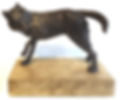
of the form for our examination and contemplation. Nearby is Animus, a black wolf statuette with the markings of being pieced together, too. So much is conveyed in this pair, beginning with the titles. Anima (female) and Animus (male) both come from the Latin root “anim” meaning breath or spirit. Suffice it to say that the white animal on the black stand and the black animal on the white stand are a visual pair—a yin-yang. Further contemplation allows that both deer and wolves are social animals. Both rely on each other for survival—the deer is a food source for the wolf, the wolf assists the deer in population control. And

both deer and wolves are symbols of strong intuition—for deer it is in gracefully changing direction while in wolves it is toward cooperation. Yet, as I go through all the works in this collection, I am aware that they are presented as dead. Some look taxidermied, skins that have been sewn together; others are skulls or heads attached to human handiwork that paints a fuller picture of preservation and reliquary or a sacred object itself. In the sacred object camp is the show stopping Provider, while the gold lining of many of the ceramic pieces lets us know their preciousness. Standing amongst these works I think of a great quote by Chief Joseph, “Every animal knows more than you do.” And an artist who can connect nature and culture so meaningfully, honors the wisdom of both.
Rachel Romano presents large-scale, figurative works that bring to mind both Renaissance

painters like Botticelli and Art Nouveau painters like Gustav Klimt in their style. But they also connect with contemporary artists like John Currin as her themes touch on myth, current concerns, and personal stories. Paramour, which is centered at the back of the long hallway that runs down the center of the Collective galleries, is a strange version of The Rape of Europa. Instead of a white bull is a white, long-horned goat. Vines with red flowers entwine the figures that float in a cloud-filled sky. It is interesting that Romano has replaced the bull,

a symbol of vitality and virility, with a goat, a symbol of independence. This turns an abduction scene into a scene of a collaborative relationship. Another painting of a woman is Taming of Orquevaux. On investigating, I found
that Orquevaux is a commune in northeastern France that offers an artist residency. In this painting the figure appears to be either squashing or riding on the back of a bent peacock whose tail feathers rise around the figure. A peacock is a symbol of the spiritual, of vision, and of resurrection. A bulb or tuber is suspended, glowing magically between
the arched hands of the woman pictured. This could symbolize not yet fulfilled potential as a bulb or tuber holds nutrients and buds for a
plant. Because the faces of each of these

figures bear such a close resemblance, I see them as two parts of a narrative, perhaps a narrative on the artist herself. It is easy to get caught up in these paintings with their soft luminous colors and hints of gold. Even the gold-brushed framing is stately elegance. But there is also something unusual about these works and I get the clue from the titles of her conte and chalk drawings. Each is called"Archetype”,(pictured above on the card) and even though they have slight differences in features, more cosmetic than individual, they have the same neutral expression. And this type of neutrality carries into each of the human figures as well. With the exception of Bellwether (a painting where two apes appear to be screaming, one showing teeth aggressively), the expression in these paintings comes through the incidental objects depicted and the composition, that is, the curves of the shapes of color. And this color is flat, not fleshy or deep, and carefully balanced, causing everything to feel like props in a Jungian dream.
Karen Rapp Bull seems to come from a painterly place. Her paint is heavy-handed. Her colors are brash. Her compositions are smudged, sitting on that line toward abstraction. But they are so present in their materiality

that even in her trancelike images such as
The Dream of the Flying Fish or Nightscape with a Creature and Three Fishes, there is a mesmerizing and physical quality that says “world”. I can make out the shapes of the objects and animals, glowing moon and shining stars, details in the land and plants which also show areas of reflected light. And, especially with the goldfish, I think of Matisse, particularly his “goldfish” paintings and his night studio works. Yet, in the painting Manifesting the Goddess, I think of Bonnard’s artistry in sharing the intimacy of his wife at her bath. Karen Rapp Bull is an “intimacy” painter who does not limit herself to figurative work only, there are plenty of painterly flowers and landscapes. Verdure


and Sprouts seems to mix both a still life and a landscape. I feel like a bug settled into a flowery sphere of dissolving shapes of green, red, blue, white, and violet. There is no indication of ground or sky for that matter, only the shapes and colors I experience. I am one with the plants. While in Bouquet in a Blue Vase (pictured above on the card), I am an observer of an indeterminate space. Yellow, orange and green streaks make a dense and sun-filled atmosphere. A classic blue vase rises from the bottom making the edge of the painting the supporting ledge. Above the vase red, green, white, and blue color hint at the profusion of flowers. Like her figures, some of these constructs are inside and some of these are outdoors. All are treated with the same palette and exuberance of applying and scraping and smearing which creates energy. As does her way of describing through color— light versus dark, warm versus cool. In this way she reminds me of the Bay Area Figurative painters like Elmer Bischoff, David Park, Joan Brown, and Henrietta Berk. There is much here that speaks to life, its mystery and joy.
This group of Collective artists will be exhibiting their work through February 10th. Cerulean Arts is at 1355 Ridge Avenue in Philadelphia. They are open Wednesday through Friday 10 am to 6 pm and Saturday and Sunday 12 pm to 6 pm. To find out more about Cerulean Arts and see additional artwork go to www.ceruleanarts.com/pages/exhibitionswhere there is a link to each artist by name.